How to Mix and Match Colour in the Kitchen
The kitchen is where tasteful and daring combinations are made everyday – so why not design the space to reflect this by getting creative and pairing beautiful colours together? Here at CTD Tiles, we offer products in a variety of colours, materials, sizes and textures, meaning that no matter what combination you want to go for, we've got you covered!
Possible Colour Combinations
Choosing what colours to put together is often followed by an influx of time deciding on the specific shades that match without overwhelming the space. Of course, you have the classic colour palettes that are best expressed through certain aesthetics, such as whites and greys for a minimalist look or greens and pinks for the more maximalist abode.
Blue and Green
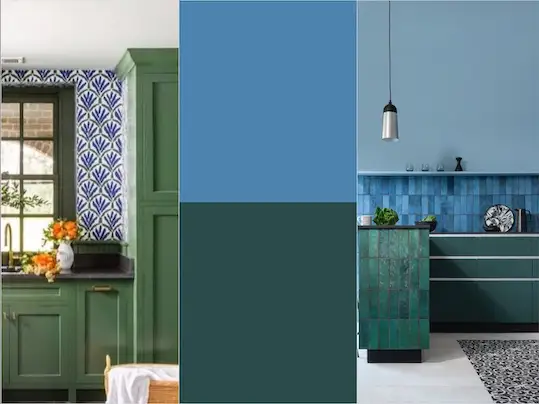
Image credits: madaboutthehouse.com (Left)
A daring partnership that creates an organically serene space which can be achieved through either paint, wallpaper, or tiles, and through a variety of hues. Our beautiful Dyroy Green Tiles and Dyroy Blue Tiles, shown matched in the image above, present this combination to perfection – two beautiful shades that complement each other in a stylish and seamless fashion.
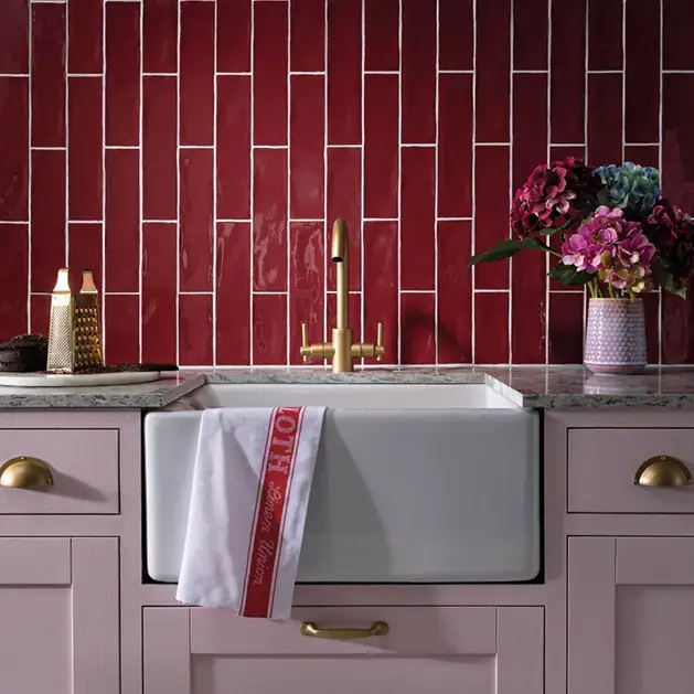
Pink and Red
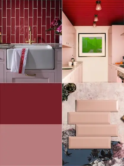
Image credits: CTD Tiles (Top left and bottom right), domino.com (Top right)
A romantic union of colours, reds and pinks are sure to inject a lovely atmosphere into any space. Choosing to paint your kitchen walls or cupboards pink and pairing with rich red tiles, such as our Poitiers Bordeaux Gloss Tiles, is a wonderful way to pull these two colours together for an elegant finish. Alternatively, opt for some pink tiles, like our Devon Pink Tiles and team with red accents through accessories or even appliances.
Pink and Green
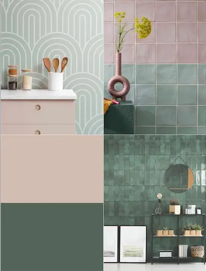
Image credits: melanielissackinteriors.com (Middle), CTD Tiles (Right and bottom)
Two shades that can be coupled in a variety of ways and still create a harmonious finish, pink and green kitchens have seen an influx in popularity recently. For those wanting a lighter shade of green, our Nador Mint Gloss Tiles are the perfect choice to introduce a refreshing sense into the room, or for the darker palette lovers, our Titan Forest Green Tiles create a stunning and enriched impact.
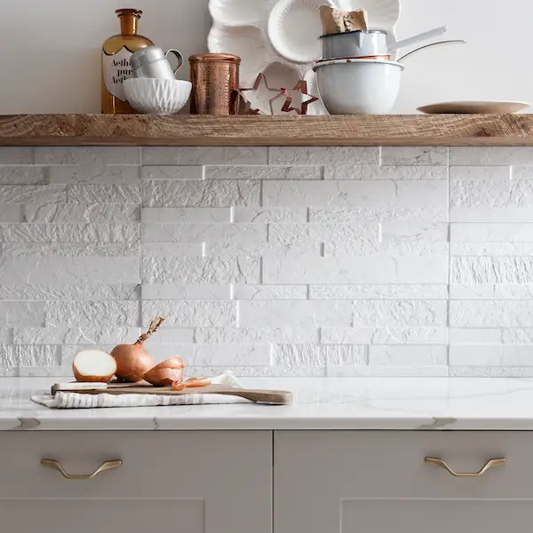
Cream and Beige
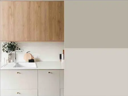
Image credit: houseloves.com (Left)
For those who favour more neutral tones, the sentiments of cream and beige, along with a plethora of other muted hues, bring a refreshing and sleek look to any kitchen. These shades will work beautifully when complemented with accents of gold, botanical details and wooden worktops, creating a clean and chic aesthetic.
We offer a fantastic array of various shades and textures in whites and creams that are perfect for this partnering, such as the Devon Pearl Tile for a glossy and sleek finish or the Knole Concept White Ceramic Tile for a more textured appeal. The possibilities are endless with neutral coloured tiles, which makes this one of the more popular palettes to choose for interiors.
How to Pair Them
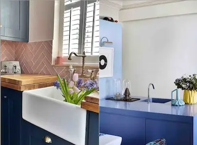
Image credits: @hamlynhome (Left), Architectural Digest (Right)
Once you've chosen your kitchen colour combination you then have to think of what else you'll team it with: cupboards, worktops, decorations, there's a long checklist, but fear not – we're here to help!
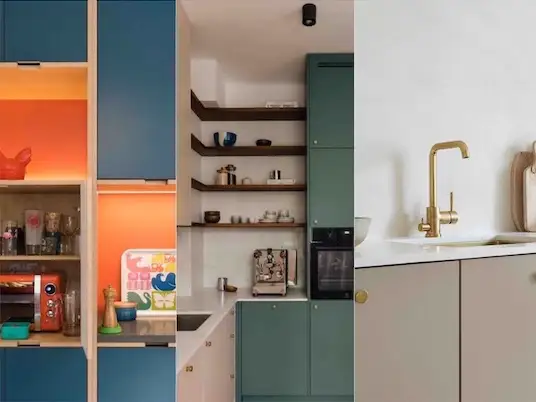
Image credits: woodandwire.co.uk (Left), @KWStudio (Middle), mundadaa.blogspot.com (Right)
Think about what final look you want to achieve and then you can mould your choices from there. For example, if a cottagecore vibe is for you then choose lighter woods, with some refreshing patterned tiles and floral accents to create the organic, countryside feel. Or to for a darker, more gothic feel, then opting for darker cabinets with silver handles along with black or blue tiles will perfectly complement this palette.
A tiled splashback is a great way to split up the colours in your chosen palette, whether you combine different coloured tiles or stick to one of the shades on your tiles and another on your cabinetry, for example.
Do's and Don'ts of Colour Pairings
The rules of colour are normally pretty simple, however, they can be difficult to obey at times. So we've compiled a few do's and don'ts of colour to help you out!
Do: Choose Complementary Colours
Use complementary colours that are meant to be coupled together. Choosing two colours that sit opposite each other on the colour wheel can create a harmonious and vibrant interior, so you definitely should incorporate multiple shades of the two colours to create a balance.
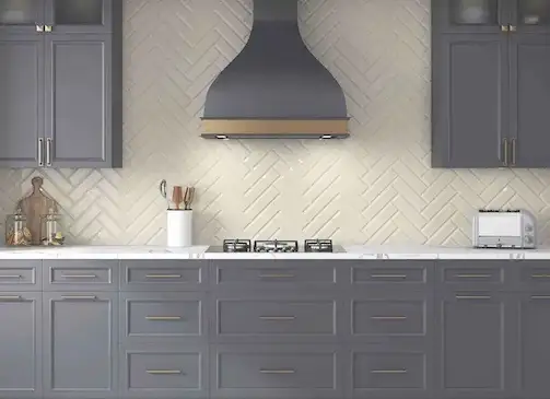
Don't: Opt For Christmas Colours
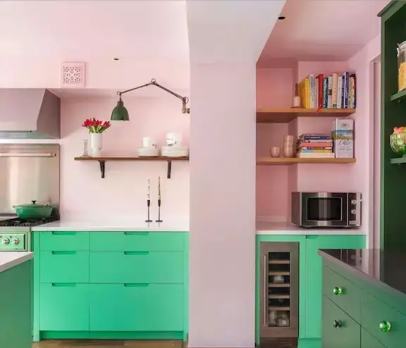
Image credit: sustainablekitchens.co.uk
Don't use Christmas colours! Although red and green lay opposite each other on the colour wheel, these two shades can make your space look like Santa's workshop. Instead, use a lighter shade of pink with green – this will make for a much more sumptuous result.
Do: Follow the 60-30-10 Rule
Apply the 60-30-10 rule. Balancing out colour using this rule of ratios will provide the best results. Design your room with 60% of one colour; this will be the dominant shade and provide a gorgeous backdrop that you can base your choice of accents and secondary colour on. 30% of your room should then be your secondary colour, not to overpower the first but to create a harmonious result. Then the final 10% should be an accent colour that can either be a different shade of your 60% colour or your 30% colour. By following this logistical rule, your space should be designed to perfection.
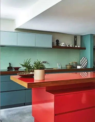
Image credit: madaboutthehouse.com
Using tiles as either the 30% or 10% can be a great way to add texture to the kitchen and can act as a break between the colours with a variety of textures or patterns. Our Varadero Tiles are available in a range of colours, meaning they can be partnered with multiple schemes and add an extra edge of style into the space. Or if you want more texture then the Tiffany Tiles or the Cliveden Concept tiles are a perfect inclusion to enhance the room.
Don't: Use Three Colours
Using more than three main colours can overwhelm the space and mean that the base colours look mismatched. Sticking to a maximum of three colours means that your space will stay looking neat and tidy without overpowering the room. The 60-30-10 theory exists for a reason!
Image credits: jaellundtofta.de (Top left), @northeastreno (Top right), homestolove.com.au (Bottom left), hunker.com (Bottom right)
At the heart of the home, the kitchen is the space where we entertain guests, feed our family, and keep ourselves nourished. So making sure the room is both tasteful through the food we make and the design we choose is vital. Think outside the box and don't be afraid to try colours you've never thought to try before.
Here at CTD Tiles we encourage creativity in the home, from kitchens to bathrooms, tiles hold the ability to accentuate a room to tie it all together.