Not just an 80s trend, purple is back and with bang! As we step into 2022, many of us will be thinking about how we can update and make a real impact in our homes.
With Pantone announcing Very Peri as its Colour of the Year for 2022, purple has now become a major talking point, and we’re here for it! If you’re keen to hear more about how you can bring this colour into your home, we’ve got you covered. From the kitchen to the bathroom, stick around to find out everything you need to know about this delightful hue.

Channel It Into the Bathroom
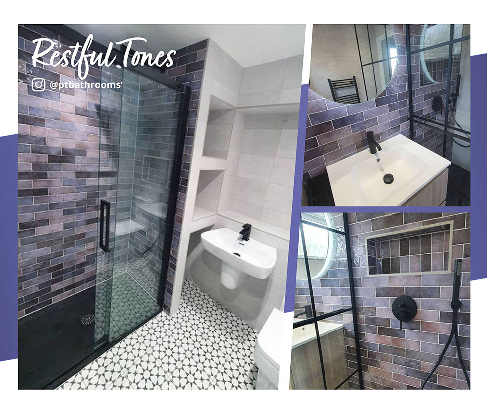
A soothing blue with subtle red undertones, purple is perfect for creating a tranquil and relaxing bathroom environment. As seen here in @ptbathrooms’ bathroom project, the designer has used our lovely Dyroy Aubergine tile as a stunning feature wall for a shower space and splashback renovation. Because of the tile’s depth, it sits beautifully against neutrals to give the room contrast and character. The restful tones are also the right amount of dark without being too overpowering.

Pictured: Dyroy (Wall) & Cuban (Floor)
If you’re daring enough, you can even mix it up with brighter colours for some serious wow factor. We would also recommend making sure that your interior is adequately lit to avoid a cave-like feel, especially if you go with a half-way tiled look and are looking to paint the walls in a darker shade to complement.
Embrace It Across the Kitchen
Purple can make a real statement in the kitchen too. Thanks to the broad spectrum of purples around, you can tailor this colour to suit your own individual style.
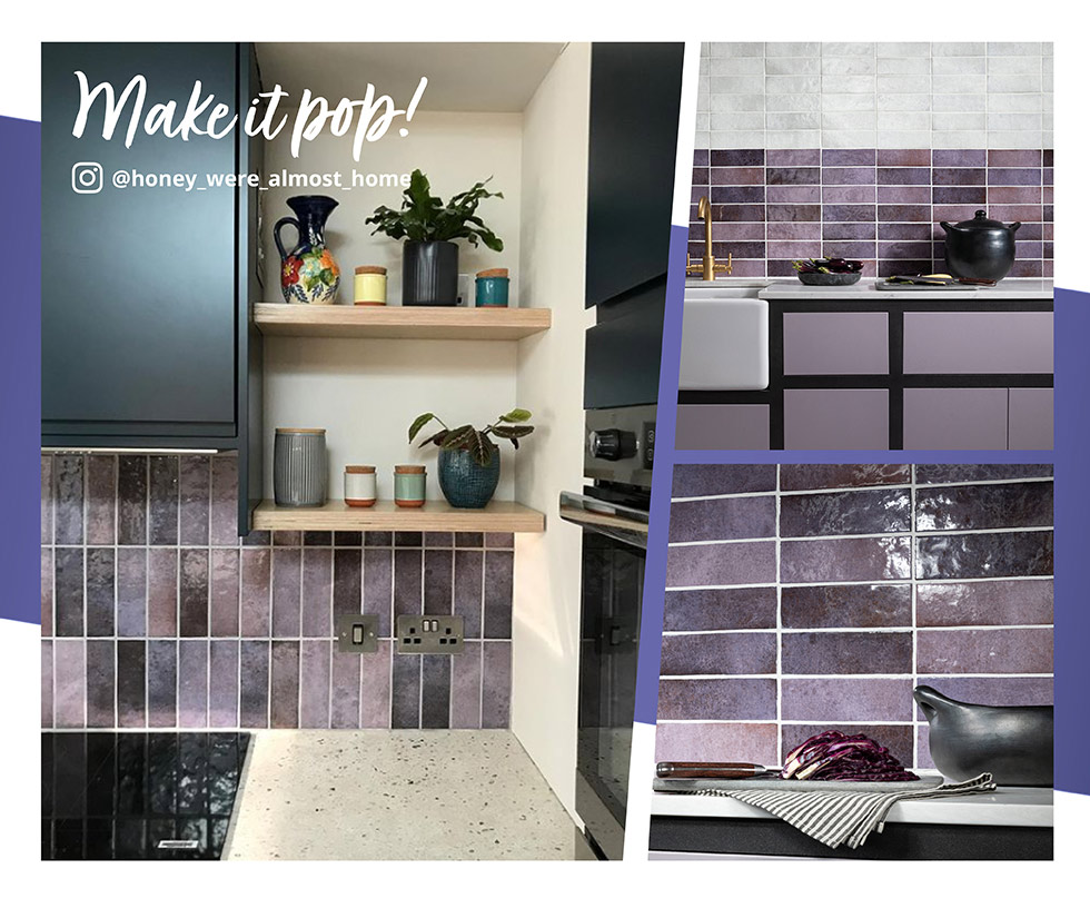
When it comes to busy rooms like the kitchen, it’s always recommended to complement dark tones with light and bright palettes to open up the space. If you’ve chosen purple cabinets in a deeper palette, lighter walls will create a beautiful two-tone effect.

Homeowner @honey_were_almost_home has used the Dyroy Aubergine tile in a vertical subway style format across her kitchen. It sits beautifully against the white worktops and walls with textured wooden shelving and pretty planters to pull the scheme together. They have also opted for black cabinetry to bring that extra bit of contrast, allowing the tiles to really pop.
Simple Purple Accents
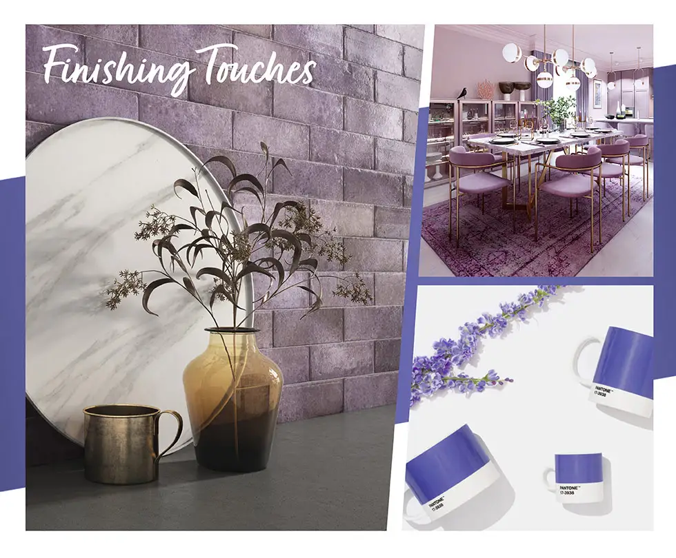
For those of you that are keen to bring this on-trend shade into the home in a subtle way, this can easily be done through accents. Accessories and small finishing touches are perfect for a minimal update, especially if you aren’t wanting to go all-out.

If you’re focusing on one wall in particular, picture frames and artwork are a lovely way to add a pop of purple - you can opt for a coordinating set of prints, all framed in the same shade. Simple touches also provide an opportunity to change it up down the line or add more in if you’ve decided that it’s a look that you want to make more prominent.
Ready to take the plunge with purple? We hope this blog has influenced you to take on Pantone’s Very Peri and incorporate it into your home in your own way! Let us know how it goes!
View Colourful Tiles
Browse Our Customer Gallery