One of the most impactful and simple ways to make a statement in your home is through colour. Take a scroll through our blog for everything you need to know about embracing the colour drenching trend!
How to Achieve the Colour Drenching Look
Colour drenching is all about taking one colour and using it in various shades across the room, from the surface to the ceilings and floor - there is nothing in your home that can’t be drenched in colour.
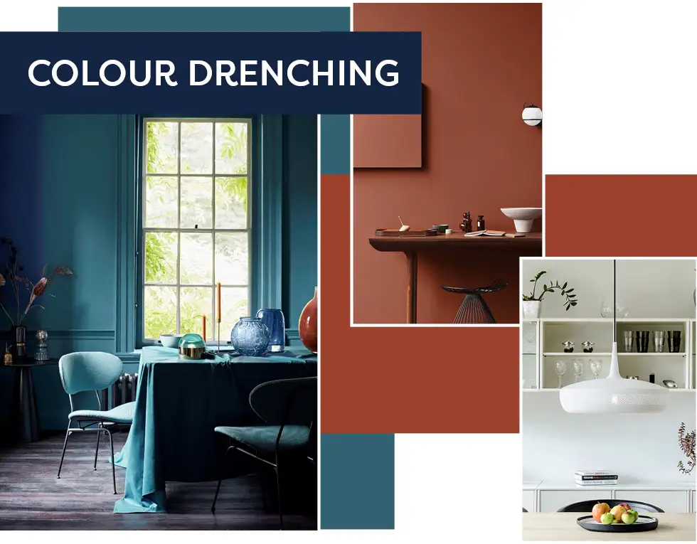
It plays such an important role in our homes. Whether you incorporate it through paint, tiles, furniture or even accessories, different shades will help you to create your own style and aesthetic.
If you’re looking to recreate the colour drenched look in your home, we’re here to help. Keep reading to find out all the ways you can embrace this colourful and vibrant trend below!
Colour Drenching in the Kitchen
With kitchens now being multi-functional rooms, it’s important to choose a colour scheme that you will love for years to come. Two colours we are loving the look of at the moment are pretty pinks and playful purples as they bring a rich and luxurious feel to the hub of the home, and they’re perfect for achieving that colour drenching look!
View the collection: Poitiers | Havana
The deep hues of our Aubergine Dyroy tile in particular provide a perennially popular look. Its small-format, metro-inspired design oozes charm and sophistication and works strikingly with lavender kitchen cabinets and deliciously deep purple paint across the walls, leaving an eye-popping visual appeal.
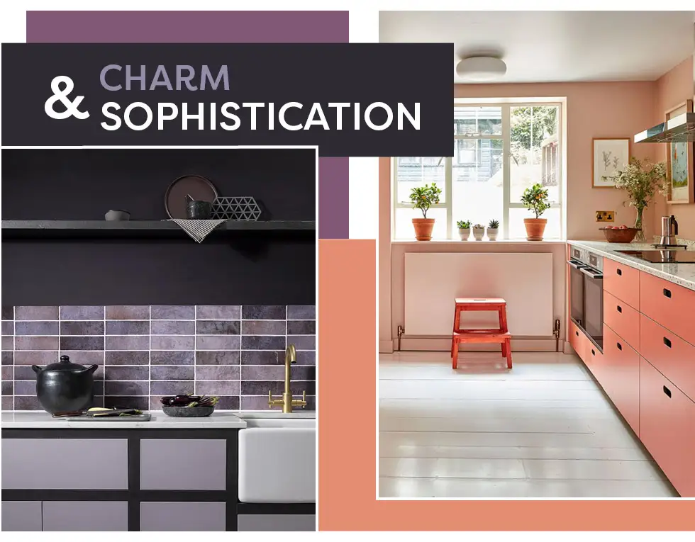
Pictured left: Dyroy
For pops of pink, the gorgeous shade found across this kitchen from Pluck creates the ultimate colour drenching effect. The look is completed with a more subtle peach paint across the walls, leaving an eye-popping visual appeal.
Colour Drenching in the Bedroom
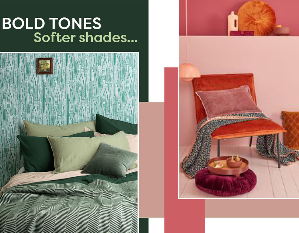
Now when it comes to your bedroom, you don’t necessarily have to stick to rich colours, you can use a mix of vibrant and soft shades. The combination of greens in this bedroom setting from MissPrint show how to mix bold tones with softer shades, from the wallpaper through to the cushions. This type of look can be carried out across all different colour palettes, whether that’s red, yellow, orange or blue, the options are limitless when it comes to updating the cosy haven that is your bedroom.
Colour Drenching in the Bathroom
Bathrooms are typically overlooked when it comes to injecting colour into the home. Instead of your bathroom being camouflaged in a sea of white, chrome or grey, why not make a statement and make the room stand out on its own? Be bold and use your bathroom as a canvas for incorporating vibrancy!
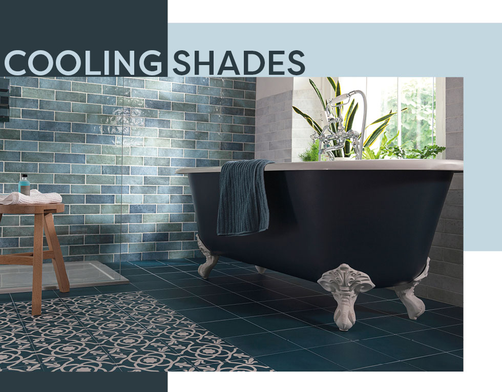
View the collection: Dyroy | Contrasti
We particularly love blue in the bathroom! Often regarded as a colour of tranquillity, the cooling shades exude a minimalist appeal, especially when it’s used across all different variations and tones. For a beautifully pulled together scheme, consider combining tiles such as our Dyroy Aqua tiles with a stunning painted freestanding bath, ceramics and accessories in a toned-down shade for an utterly cohesive space.
If you’re keen to find out even more ways you can decorate your ensuites or cloakrooms with bathroom tiles, take a look at our full collection of bathroom tiles for inspiration.
View all our Bathroom Tiles